Dental Pro — Premium Dental Clinic Concept Site
A concept site for a dental clinic with three signature UX touches: a three-step online booking flow, animated stat counters, and a letter-by-letter hero reveal. 10 sections on a single page — from service catalogue to interactive booking.
Results
-
10 sections: Hero → Stats → Why us → Services → Doctors → FAQ → Booking → Final CTA
-
Multi-step booking flow: pick service → date/doctor/time → contact info. Active state highlighted at every step
-
Stat counters animate from 0 to target on viewport entry (12 years, 8500+ patients, 78+ certifications)
-
6-doctor showcase with 'Available today' badges and detailed credentials
-
FAQ accordion built on native `<details>` — works without JavaScript
-
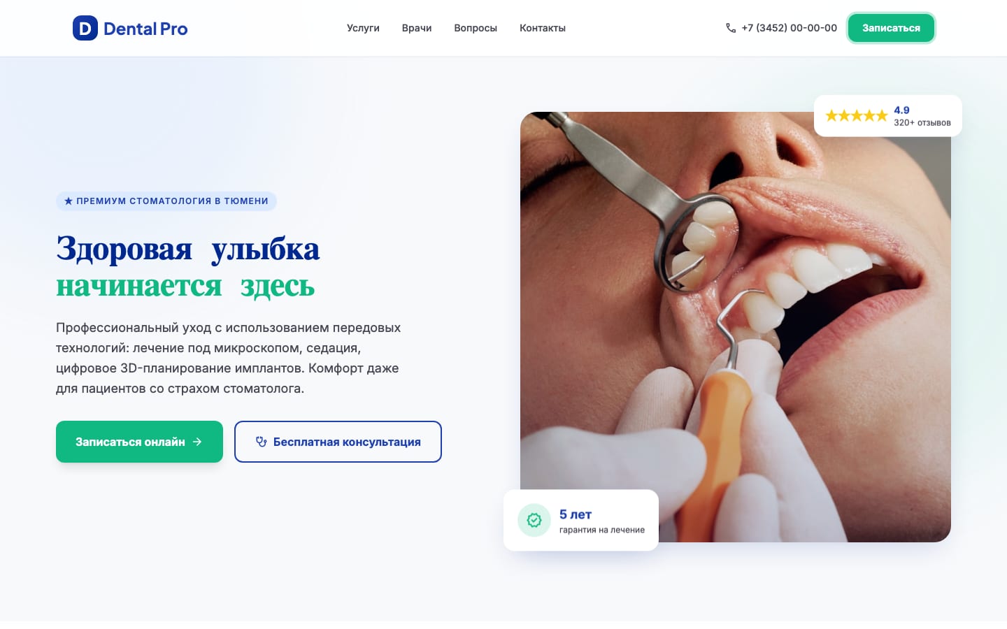
Hero title assembles letter by letter in two colors (deep blue + mint green) over a pulsing blob backdrop
The brief
Show what a modern dental clinic site should look like: not “a price list with a phone number in the footer,” but a professional digital clinic that earns trust on the first screen and converts visitors into bookings with minimum friction.
The “Clinical Excellence” concept: premium medicine without clinical coldness. Deep blue (#1E40AF) for authority, mint green (#10B981) reserved strictly for CTAs — health and “fresh” cues. Plus Jakarta Sans + Inter typography, soft rounded shapes (12-16px), gentle ambient shadows.
The solution
The starting point was a custom “Clinical Excellence” design system: deep blue + mint green + tertiary light blue, a Plus Jakarta Sans (headings) + Inter (body) typography pair, rounded 8-16px shapes, and ambient shadows with a subtle blue tint. Four concept screens were designed against that system (home, services, doctors, booking), with detailed wireframes and components. From there — manual assembly into a complete one-pager with advanced UX touches.
Multi-step booking flow
Not a dull “name / phone / comment” form, but a step-by-step scenario:
- Service selection — 4 cards with icons (Initial exam, Hygiene, Caries treatment, Other). The active one gets a green border and a tinted background.
- Date + doctor + time — native
<input type="date">, doctor select with specialization, time chip buttons. The active slot has a blue outline and a lighter background. - Contacts — name, phone, optional comment. Submit morphs the button into ”✓ Booking confirmed.”
A sidebar carries a contacts card with a map and a “Don’t want to choose yourself?” callback box — a fallback for visitors who don’t complete the main form.
Animated stat counters
The “12 years / 8500+ patients / 12 doctors / 78+ certifications” block — numbers tick from 0 to target with 1 - (1-t)³ easing (decel-out). The animation runs once on viewport entry via a dedicated IntersectionObserver at threshold 0.5.
Hero with two-color letter reveal
“Healthy smile / starts here” assembles character by character, 70 ms apart. The first line is text-primary-dark, the second text-secondary (green). Behind the content — two pulsing blobs (bg-tertiary/70 and bg-secondary/15) on a 16-second translate + scale loop.
The hero carries two floating cards on a floatY delay: “5-year warranty” with a green icon, and ”★ 4.9 / 320+ reviews.” They float at different phases for a live feel.
Section differentiation via blob backgrounds
Each section has its own background accent:
- Services — large
bg-tertiary/40blob top-center - Doctors —
bg-secondary/10blob bottom-right - Booking —
bg-tertiary/50blob top-left - Final CTA — two blobs over a primary gradient
All blobs run blur-3xl with individual animation-delay values so they don’t pulse in sync.
Doctor cards with availability badge
6 doctors in a 3×2 grid (down to single column on mobile). Each card — 4:5 portrait, name, specialization, years of experience, university, certifications, and a “Book” CTA. Three of six carry a ”🟢 Available today” badge — a realistic detail that adds urgency.
FAQ via native <details>
5 questions in <details>/<summary> — open without JS, accessibility for free. The expand_more arrow rotates 180° via the [open] CSS selector. The heading turns blue on open.
The outcome
The site is live at dental.nazarov-evgeniy.pro over HTTPS (Let’s Encrypt), loading in milliseconds (~70 KB of HTML). There’s no backend — this is a concept demo, no real clinic. For production: hook the booking form to a CRM (1С Medesk, IDENT), drop in real doctor photos, plug in a real address, and write SEO copy.
The site is architecturally ready to scale: add a promotions section, a medical blog, dedicated pages for specific services (/implantatsiya/, /breket-sistemy/) — the structure and styles allow this without a refactor.
Tech stack
- Frontend: Vanilla HTML5 + Tailwind CSS (CDN, no build) + Vanilla JS
- Animations: CSS @keyframes (blob pulse, floatY, fadeUp, pulse-glow on CTA), IntersectionObserver for scroll reveal and stat counters,
easeOutCubicfor the counter - Typography: Plus Jakarta Sans 500-800 (headings), Inter 400-700 (body), Material Symbols (icons)
- Imagery: Unsplash for the hero photo + randomuser.me for doctor portraits (demo data)
- UX patterns: multi-step form with active states, native
<details>for FAQ, sticky header with pulse-glow CTA, floating panels - Design stage: custom “Clinical Excellence” design system (palette, typography, shadows, radii, spacing tokens) for a premium-dentistry brand concept
- Hosting: own VPS, Nginx + Let’s Encrypt SSL
Ready to discuss your project?
Free audit and preliminary estimate within 24 hours of your request.
Send a request