StroyGroup — Construction Company Concept Site
A premium concept site for a homebuilder with a live cost calculator, working catalogue filters, and a multi-layer animated background. 11 sections on a single page — from project catalogue to an engineer-callout form.
Results
-
11 sections: Hero → Stats → Why us → Process → Project catalogue → Calculator → Team → Reviews → FAQ → Contacts → Final CTA
-
Live cost calculator: material × area slider × floors × foundation × finish × extras — instant recalculation
-
6-project catalogue with three working filters (type, floors, budget) — no reload, vanilla JS
-
Multi-layer background animation: a drifting grid behind everything, scan-beams in light sections, twinkling-dots in dark ones, blob pulse in every section
-
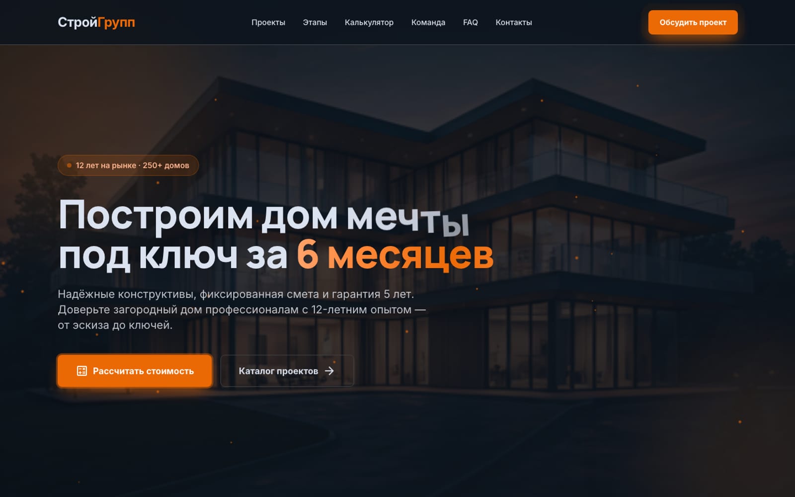
Hero with letter-by-letter assembly, shimmer on '6 months', 26 floating particles, mouse parallax, Ken Burns
The brief
Show what a serious suburban homebuilder’s website should look like — not “price list + phone in the footer,” but a complete digital showcase with a transparent process, a live cost estimate, and a strong visual language. The site must telegraph from the first screen: fixed price, deadlines in the contract, 5-year warranty, in-house crews.
The “Solid Construction” concept: a dark theme as a metaphor for reliability and premium positioning, a warm orange accent (#EC6A06) — energy of the build process and warmth of the finished home. Manrope + Inter typography, contrasting grid, ambient shadows with an orange undertone on hover.
The solution
The starting point was a custom “Solid Construction” design system: six surface tokens (from bg #0d141d to surface-highest #2e353f), an orange primary scale with a glow variant, a Manrope (headings up to 64px) + Inter (body) type pair, 4–16px radii, ambient shadows with an orange undertone. Four concept screens were designed against that system (home, catalogue, calculator, contacts). From there — manual assembly into a long one-pager with advanced animation and interactivity.
Live cost calculator
Not “leave your phone, we’ll call back,” but real-time price recalculation:
- Material — brick / aerated concrete / timber-frame (multipliers 1.0 / 0.85 / 0.7)
- Area — 50–350 m² slider, step 10
- Floors — 1 / 2 / 3+ (1.0 / 1.15 / 1.3)
- Foundation — strip / pile / monolithic (1.0 / 1.1 / 1.25)
- Finish — rough / mid / turnkey (0.75 / 1.0 / 1.35)
- Extras — garage / balcony / sauna / terrace (fixed adds from ₽400 k to ₽1.1 mln)
Formula: area × ₽75,000/m² × type × floors × foundation × finish + Σ extras. Any change — instant recalculation. The result panel sticks to the right as you scroll.
Catalogue with working filters
6 projects with three data-* attributes and three selects. One change handler toggles proj-hidden on cards. When nothing matches — a friendly empty state.
Multi-layer background animation
The defining feature versus a typical builder site — every dark section “breathes”:
- Global grid — a
fixedlayer behind all content, orange 60×60px lines drifting diagonally on a 30-second loop, faded by a radial mask at the edges - Scan-beams in Why us / Catalogue / Reviews — two diagonal light beams rotating with different phases (18 s and 22 s) — a job-site spotlight feel
- Twinkling-dots in Process / Team / FAQ — 14–22 blinking orange dots per section, each with its own 3–7 second rhythm
- Blob pulse — 1–2 blurred colour patches per dark section, pulsing with individual delays
All disabled under @media (prefers-reduced-motion: reduce).
Hero with extended choreography
“We’ll build the house of your dreams” assembles character by character with 60 ms delays and a slight rotateZ(-8deg) flourish. “6 months” runs a shimmer gradient (linear-gradient + background-position). Behind it — a Ken Burns render of a modern home, 26 orange particles drifting upward at varying speeds. The content follows the cursor (mouse parallax ±16 px). The primary CTA carries a pulse-glow keyframe with an expanding orange halo.
Process 01–06
6 cards with oversized number badges in the corner. The duration of each stage gets an orange tint (1 week → 2 weeks). 3-column grid on desktop, single column on mobile. Scroll-reveal stagger fires cards in 90 ms increments — a natural visual rhythm.
Team
A panel with the crew photo, big stats (42 staff, 12 engineers, 98% on-time deliveries in 2025, 187 acceptance-checklist items) and a floating “SRO permit” card with a deep shadow — a design touch that adds trust.
FAQ via native <details>
5 questions in <details>/<summary> — open without JS, accessibility for free. The expand_more arrow rotates 180° via the [open] CSS selector. The open question heading turns orange.
Callout form with realistic fields
Not “name/phone” in a row, but a real request: name, phone, email, project type (catalogue / custom / adaptation / measurement), comment, preferred date for the engineer visit via <input type="date">. Submit morphs the button into ”✓ Request sent — we’ll be in touch within an hour.” Beside it — a sidebar with office details and a “Don’t like forms?” callback block.
The outcome
The site is live at stroy.nazarov-evgeniy.pro over HTTPS (Let’s Encrypt), loading in milliseconds (~75 KB index.html). No backend — this is a concept demo. For production: hook the form to 1C or amoCRM, replace renders with real builds, write SEO copy for long-tail queries.
Architecturally ready to scale: a promotions section, dedicated pages for each project (/projects/omega/), an extended calculator (2-car garage, pool, attic) — the structure and styles allow this without a refactor.
Tech stack
- Frontend: Vanilla HTML5 + Tailwind CSS (CDN, no build) + Vanilla JS
- Animations: CSS @keyframes (Ken Burns, blob pulse, letter reveal, shimmer, particle float-up, grid drift, scan beams, twinkle dots, pulse-glow), IntersectionObserver for scroll-reveal and stat counters,
easeOutCubicfor the counter - Typography: Manrope 500–900 (headings), Inter 400–700 (body), Material Symbols (icons)
- Imagery: AI art tuned to the brand palette + Unsplash for supplementary projects and the team
- UX patterns: live calculator with multipliers, catalogue filters without reload, sticky result panel, native
<details>FAQ, sticky header with pulse-glow CTA, multi-layer animated backgrounds - Design stage: in-house “Solid Construction” design system (palette, typography, shadows, radii, spacing tokens) for a premium-builder brand concept
- Hosting: own VPS, Nginx + Let’s Encrypt SSL
Ready to discuss your project?
Free audit and preliminary estimate within 24 hours of your request.
Send a request